No products in the cart.
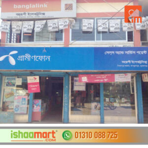
Signboard design
250.00৳
ADVERTISING AGENCY IN BANGLADESH | ALUMINIUM COMPOSITE PANEL BD | ALUMINIUM THAI GLASS DESIGN BD | BILLBOARD ADVERTISING AND RENT | CAR RENT | EVENT MANAGEMENT COMPANY BD | GLASS STICKER SUPPLIER AND PROVIDER | ICONE DEVELOPER | SIGNBOARD SOLUTION | ONLINE SHOPPING COMPLEX | ACRYLIC 3D SS LETTER SIGNAGE | SIGNBOARD AND BILLBOARD MANUFACTURER BANGLADESH | ISHATECH IT SOLUTION | LED SIGN BAZAR | LED SIGN BD LTD | NAMEPLATE SUPPLIER AND PROVIDER SHOP | NEON SIGNS | SS SIGNS | PANA SIGNS | WEB DEVELOPER | SIGNBOARD MAKER BANGLADESH | SHOP SIGN BANGLADESH | GLASS PROVIDER | WALL STICKER
Call Now: +8801310088725
Signboard design
Signboard design
- Clarity and Simplicity:
- Keep the message clear and concise. Avoid clutter and unnecessary information. Use easy-to-read fonts and make sure the text is legible from a distance.
- High Contrast Colors:
- Choose colors that provide high contrast for better visibility. Contrast between the background and text helps improve readability, especially from a distance.
- Readability:
- Use fonts that are easy to read. Avoid overly decorative or intricate fonts that may be difficult to decipher quickly. Consider the size of the text in relation to the sign’s dimensions.
- Brand Consistency:
- Ensure that the design aligns with your brand identity. Use consistent colors, fonts, and imagery that reflect your brand personality.
- Eye-Catching Graphics:
- If using graphics or images, make sure they are high quality and relevant to your message. Ensure that they enhance, rather than distract from, the overall design.
- Proper Sizing:
- Consider the size of the sign in relation to its intended viewing distance. A sign viewed from a roadway may need to be larger than one seen up close.
- White Space:
- Incorporate white space to prevent overcrowding. White space helps guide the viewer’s eyes and makes the design more visually appealing.
- Legible from a Distance:
- Ensure that the sign remains legible from a distance. Test the design by viewing it from various distances to ensure readability in different scenarios.
- Material Considerations:
- Consider the material of the sign and how it will impact the design. Different materials may have different printing capabilities and visual effects.
- Visibility in Various Lighting Conditions:
- If the sign will be viewed at night, ensure it is visible in low-light conditions. Options include reflective materials or integrated lighting.
- Message Hierarchy:
- Prioritize the most important information. Use hierarchy to guide viewers’ attention, placing critical information prominently.
- Compliance with Regulations:
- Check local regulations and zoning laws to ensure your sign complies with any restrictions on size, placement, or lighting.
- Proofreading:
- Double-check all text for spelling and grammatical errors. Mistakes can detract from the professionalism of your business.
- Test the Design:
- Before finalizing the design, consider getting feedback from others. Test the design with potential customers or colleagues to gather insights and make any necessary adjustments.
ADVERTISING AGENCY IN BANGLADESH | ALUMINIUM COMPOSITE PANEL BD | ALUMINIUM THAI GLASS DESIGN BD | BILLBOARD ADVERTISING AND RENT | CAR RENT | EVENT MANAGEMENT COMPANY BD | GLASS STICKER SUPPLIER AND PROVIDER | ICONE DEVELOPER | SIGNBOARD SOLUTION | ONLINE SHOPPING COMPLEX | ACRYLIC 3D SS LETTER SIGNAGE | SIGNBOARD AND BILLBOARD MANUFACTURER BANGLADESH | ISHATECH IT SOLUTION | LED SIGN BAZAR | LED SIGN BD LTD | NAMEPLATE SUPPLIER AND PROVIDER SHOP | NEON SIGNS | SS SIGNS | PANA SIGNS | WEB DEVELOPER | SIGNBOARD MAKER BANGLADESH | SHOP SIGN BANGLADESH | GLASS PROVIDER | WALL STICKER
Call Now: +8801310088725
- Before finalizing the design, consider getting feedback from others. Test the design with potential customers or colleagues to gather insights and make any necessary adjustments.






Reviews
There are no reviews yet.