No products in the cart.
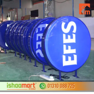
BC Optometry Store front Sign
30.00৳
Design : Choose your Customize,
Easy to cut any size to meet your demands.
#Cutting_Wall_Glass #Spider_Glass_Partition #Euro_Model_Glass #Double_Glazing_Glass
#U_Channel_Glass_Partition #Gypsum_Board_Ceiling #Mineral_Ceiling_Board
#Metal_Board_Ceiling #PVC_Ceiling_Board #Glass_Door #Hanging_Door
#Hinge_Door #Folding_Door #Hanging_Folding_Door #Shower_Door #Shower_Hinges_Door
#Hanging_Roller_Door #Sliding_Door #Sliding_Window #Protractor_Thai_Glass_Partition
#Glass_Patision #Silling_Window #Office_Patision #Textile_Section #Curtain_Wall_Section
BC Optometry Store front Sign
- Design Concept: Begin by developing a design concept that reflects the brand identity and services offered by the optometry store. Consider elements like color schemes, typography, and graphics. BC Optometry Store front Sign
- Compliance with Regulations: Ensure that the sign adheres to local regulations and bylaws regarding size, placement, and design. Different municipalities may have specific guidelines for storefront signage.
- Incorporate the Business Name: Include the name of the optometry store prominently on the sign. Use clear, legible fonts that are easy to read from a distance.
- Include the Logo: If the optometry store has a logo, incorporate it into the sign design. The logo should be appropriately sized and positioned for visibility.
- Highlight Services: Consider adding information about the services offered, such as “Eye Exams,” “Prescription Glasses,” “Contact Lenses,” etc. This helps potential customers quickly understand what the store provides.
- Utilize High-Quality Materials: Choose durable and weather-resistant materials for the sign, especially considering BC’s varying weather conditions. Options may include acrylic, aluminum, or other weather-resistant materials.
BC Optometry Store front Sign
- Opt for Illumination (Optional): Depending on the location and operating hours of the store, consider adding backlighting or LED illumination to ensure visibility even during evenings or overcast days.
- Contrast and Visibility: Ensure that the colors used in the sign offer good contrast, making the text and graphics easily readable. Avoid color combinations that may be difficult for people with vision impairments.
- Consider Location and Placement: Evaluate the store’s location, architecture, and surroundings to determine the best placement for the sign. It should be clearly visible to both pedestrian and vehicular traffic.
- Professional Installation: Hire a professional sign installer to ensure the sign is securely and safely installed. This helps prevent any potential safety hazards.
- Regular Maintenance: Schedule routine inspections and maintenance to ensure the sign remains in good condition. This includes cleaning, repairing any damage, and replacing any non-functioning lights (if applicable).
- Brand Consistency: Ensure that the storefront sign aligns with the overall branding of the optometry store, creating a cohesive and recognizable image for customers.
Design : Choose your Customize,
Easy to cut any size to meet your demands.
#Cutting_Wall_Glass #Spider_Glass_Partition #Euro_Model_Glass #Double_Glazing_Glass
#U_Channel_Glass_Partition #Gypsum_Board_Ceiling #Mineral_Ceiling_Board
#Metal_Board_Ceiling #PVC_Ceiling_Board #Glass_Door #Hanging_Door
#Hinge_Door #Folding_Door #Hanging_Folding_Door #Shower_Door #Shower_Hinges_Door
#Hanging_Roller_Door #Sliding_Door #Sliding_Window #Protractor_Thai_Glass_Partition
#Glass_Patision #Silling_Window #Office_Patision #Textile_Section #Curtain_Wall_Section










Reviews
There are no reviews yet.